Client
Eslapolla

Overview
Eslapolla started as an ESADE Executive MBA project and grew into a real brand with a real mission: make conversations about sex, safety, consent, and STI awareness less awkward and more honest. Named after the Spanish slang for "it's the shit," the brand needed an identity that could hold the tension between provocative and responsible, funny and trustworthy.
Client
Eslapolla
Industry
Sexual Wellness
Service
Brand Identity
Brand Strategy
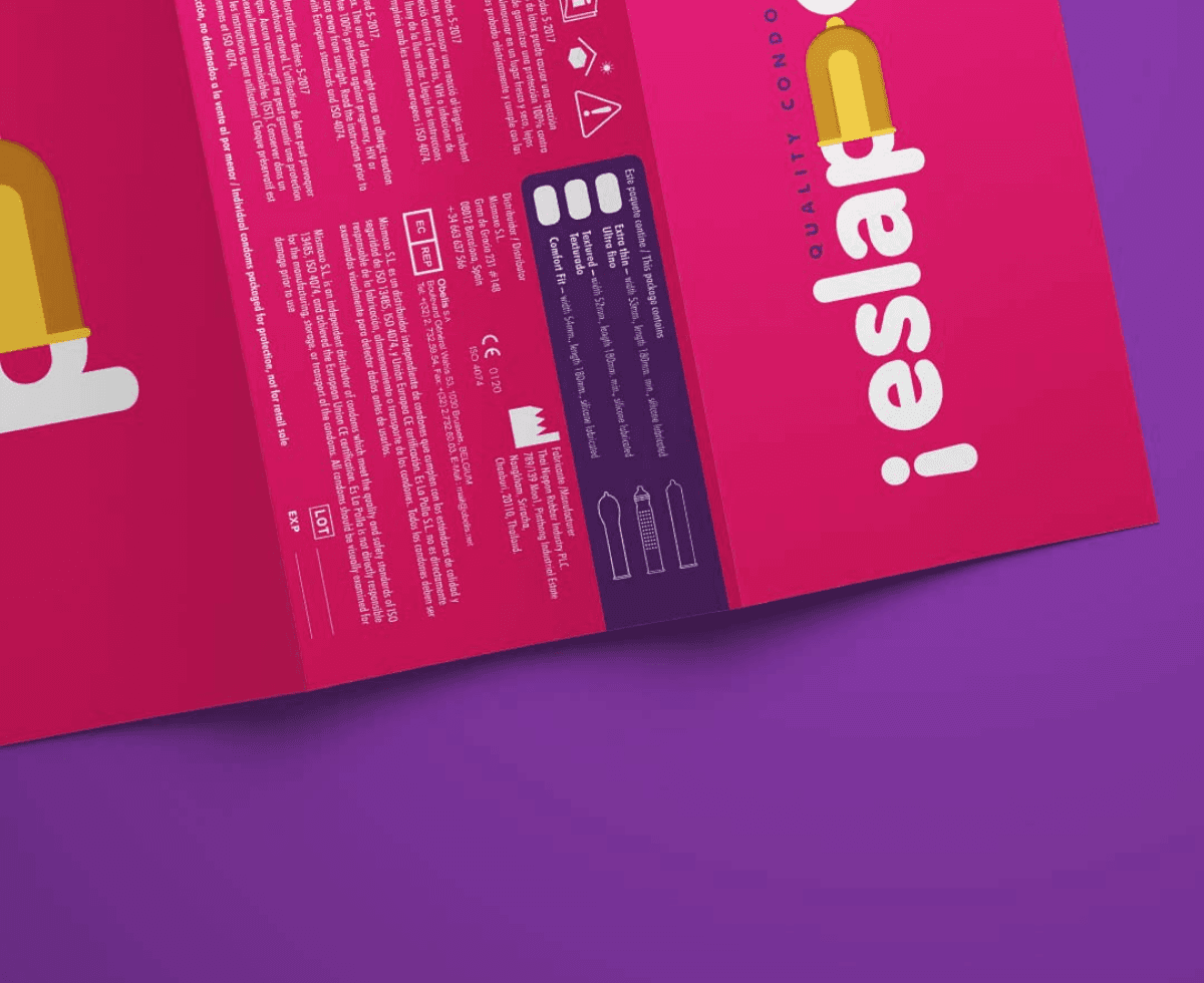
Packaging Design
Content
Advirtising
Location
Barcelona, Spain
The Challenge
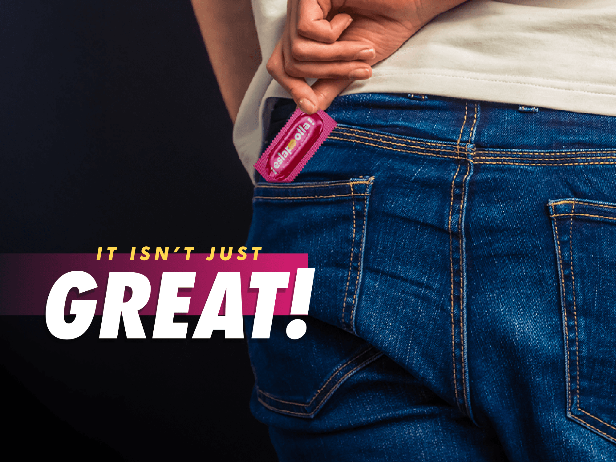
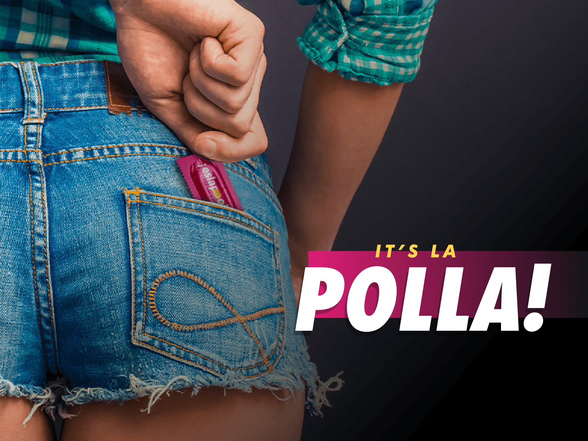
Sexual wellness is a category full of clinical packaging and hushed-up branding. Eslapolla wanted to do the opposite: be loud, be honest, and talk about sex the way people actually talk about sex. The challenge was building an identity bold enough to turn heads without losing credibility as a genuine health and education brand.
The Solution
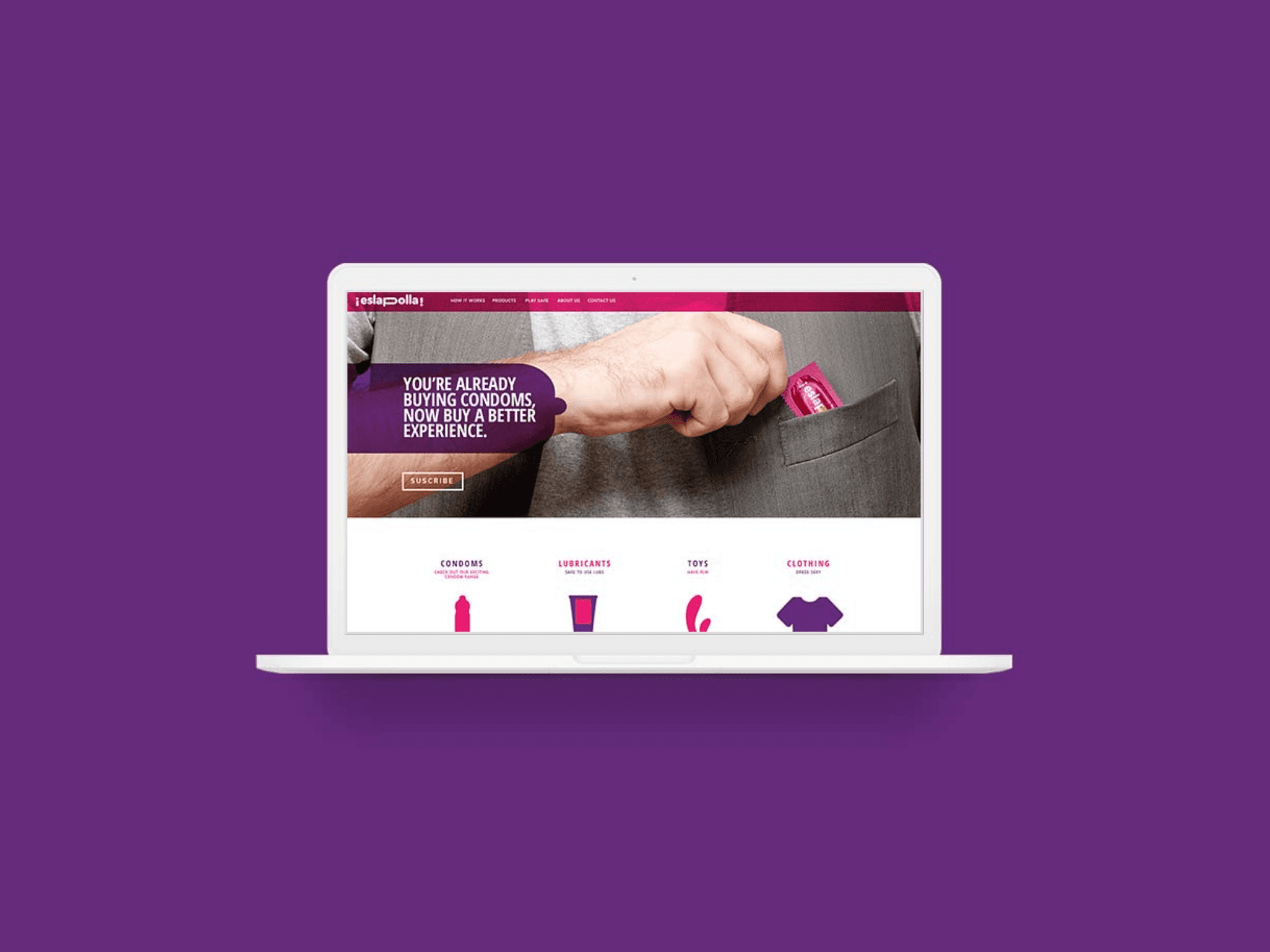
A visual identity built around confidence, colour, and attitude. The brand language leaned into the playful vulgarity of the name while grounding it in clear, purposeful communication. Typography-led, direct, and designed to stand out on a shelf and on a screen — and to make people smile before it made them think.

The Result
An identity that did what it set out to do: get people talking. Eslapolla launched with a brand that felt unlike anything else in the sexual wellness space in Spain, turning a taboo category into a conversation starter.


PORTFOLIO


Strategy
Identity
Digital
Collateral

Focacceria Da Vinci
Focacceria Da Vinci
Focacceria Da Vinci
Brand Identity
Digital Design